
Six types of colour harmony:
1) Complimentary colours- opposite on the colour wheel. For example red and green compliment each other because they are both very vivid and bright.

2) Analogous- these are next to each other on the colour wheel and often used in peaceful designs because these are found naturally in nature as the colours are quite subtly different.

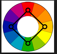
3) Rectangle (tetradic)- this is four colours, two pairs complimentary. This scheme is very colour rich
and works best if one colour is dominant.

4) Triad- these are evenly spaced around the colour wheel. to be successful the colours have to be balanced and one should be the stand-out colours and the other two should be the accents.

5) Split complimentary- this has a strong visual contrast like the complimentary pairs. These colours tend to work really well together and are often good for beginners.

6) Square- the square theme is similar to the rectangle scheme however you have to pay attention to the balance between warm and cool colours.
Connotations of colours:
Blue- calm, relaxed, peaceful
Red- danger, love, romance, anger
Yellow- happy, joyful, smiley
Green- recycling, green bins
Purple- Cadbury's, grapes
You have discovered the descriptions, but there are no images to show learning
ReplyDeleteI have added some images to show research. ^
Delete