Thursday, 20 October 2016

Logo Design Activity

Today's activity was to create a logo for my brand, I have done a blog post about my research that I did on this topic and that is what inspired me to create the logos below. Here is my Logo Research Images post.

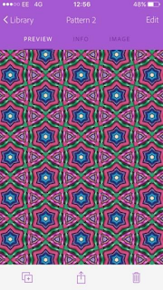
I downloaded the Adobe Capture app on my phone to create some patterns using one of my logos. I started off with a practice piece which is the first one below. This was using my coloured gel pens and this was the result. The next is using one of my logos that I sketched in my sketch book.


These are some screenshots from my actual sketch book:


I started off with a few very different designs, then developed each of them into something similar but more professional. For example the swirly font logo, I drew with many different backgrounds and colours to see which works best. My favourite one would probably be the swirly one with the triangle background in a circle. However to improve this, I would get rid of the circle, as I think it would look much simpler and more geometric which I like. I would also add some colour, as well as drawing it much larger and smaller to see how it looks in various sizes.

The colours I may use on my logo, taken from my logo research sheet from my Google Drive:


Logo Research Images

I researched 20 logos that appeal to me, I have constructed a mood board on Adobe Illustrator and here is the result:


Some of the logos I have chosen are quite well-known, however others I chose because I though they were interesting and quite clever. For example when an image is one of the letters of the logo, like the Bird and Giraffe logo. The other more well known logos I like because they are very simple and often just a collection of shapes, like the Disney and Android logo above.

The rest are quite appealing because most of them are just two contrasting colours which really makes them stand out. Overall, I think they all look very professional and use good colour schemes according to the brand.

Friday, 14 October 2016

Covermount Magazines

A covermount on a magazine is a series of planned issues that come with a 'free' collectable toy or part for a part work magazine. Our group decided on a jungle animal magazine for children, which included a free 3d animal rubber toy with every issue. This would correspond with the animal specific issue including a fact file on the selected jungle animal. The issue will also come with a free poster with images of the animal, as well as a few interesting facts.

This magazine's target audience would be for children ages 8-12, but also for the parents of the children, as they are most likely to actually buy the magazine.

I wrote some ideas and notes in my sketch book and also drew an image of what the toy would like:


Thursday, 13 October 2016

Charcoal Sketches

This morning we used pieces of charcoal to create portraits of people. This was to experiment using different drawing materials that we were not use to, for example I am more comfortable using a pencil or fine tip pen. This exercise helped more draw on a much larger scale, as well as having the ability to easily blend. I also found that instead of lots of short strokes, the charcoal makes you draw much longer which is good for quick portrait sketches.

Here are some examples that I did in my sketchbook and on paper:


The last image is definitely my favourite sketch, as there is more shading and looks a little bit more realistic. The first one I drew came out very cartoon-like and out of proportion.

Saturday, 8 October 2016

The Museum of Bath at Work

On Thursday, we took a trip to the Bath at Work Museum. Our task was to sketch an image/s from observation, exactly how we see it. I chose to draw a window silhouette, here is an image from my sketchbook:


First I drew the window outline, then the tools and machinery, after that I filled in the outlines with a pencil. Eventually I would like to go over this in a black pen to make it a solid colour. It would also look more like a silhouette with a flat black, rather than using a pencil with shading.

Friday, 7 October 2016

Accessibility

Accessibility has a few similar meanings, the main being approachable and the attribute of being easy to meet or deal with. In this case, I looked at people with disabilities including; colour blindness, dyslexics or people with very limited vocabulary. In the essay below I have thought about individual solutions for each of these disabilities and how we can present information in a way that is easily comprehensible.

I also touched on the specific activities that each disability finds difficult, for example colour blind people would find it very hard to read green writing on a red background. This would be something to avoid when creating suitable material.

Below is my accessibility that I completed on Google Docs:

Thursday, 6 October 2016

Podcasts

A podcast is an audio clip available on the internet for people to download. They are often available as a series and can be received by subscribers automatically.

The type of questions that are asked during a podcast are often very open questions, so the guests can answer with a detailed story or explanation. Podcasts in general already have a theme/topic at the start, for example Glamour magazine has a series of podcasts all dedicated to what famous people wore at important events in their life. It explains this before every audio clip, then moves straight on to the celebrity talking about the event and their outfit.

On the other hand in different podcasts, it is very much a question and answer format, sounding like a normal interview.


Wednesday, 5 October 2016

Student ID Reminder Card

Wearing our student ID around college is very important and I have put together an A5 student ID reminder card presenting the importance of wearing one. Below are some designs in my sketchbook that I drew, using bright colours and detailed patterns.


The first one is my actual card, using just three colours so the layout doesn't look to over-whelming. As well as leaving blank space around the main focal point, making sure to avoid the card looking too cluttered. The picture below is just a doodle that I did to try different colours.