Branding is a really important element of any business. Branding is to tell customers what they can expect from your products or services. The main aspect of your brand would be the logo, colour, font, size etc. The impact brand has on people is very important as company's would want customers to associate their brand as being friendly, eco- friendly, have a good reputation etc.
The logo would also have to be eye catching, rememberable and consistent throughout the products or services the business offers. This is so it will be easy for the public to recognise the logo/brand.
Here are my monster posters that I created with Illustrator with slightly different fonts and layouts so I could pick the best one. I ended up choosing the third one because it is the most visually pleasing and would catch the audiences' eye.
I chose the large bold stencil font, as the other fonts I tried did not look as effective because the first one was too stretched and could be difficult to read from further away and the second one is too complicated and takes the attention away from the monster, which I wanted to be the main part of the poster.
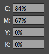
The colour scheme I used I kept pretty simple by just using different shades of green because there are quite a lot of colours in the monster already and would look too busy with a colourful background as well.
The branding guidelines of my poster are:
FONT- has to be 'Stencil' because consistency is needed when branding successfully and this specific font is quite iconic of this film.
SIZE- the minimum size the text can be is 40pt and the maximum is 170pt.
COLOUR- the colour scheme can vary, however colours that need to be included are green and black. Also the actual monster cannot be changed at all because it needs to be rememberable and iconic of my brand.
MONSTER- the colours of the monsters are explained above, however the monster can be positioned anyway other that upside down because it will not be as recognisable.