Helvetica Bold-

I have chosen this font because it stands out as a sub title against the other fonts and makes the card very clear, so that the audience know straight away if they have picked up a skill or a bad habit.
The secondary font I have used is:
Microsoft Sans Serif-
Example:

I chose this font because it is very simple and easy to read, it also works well with the Helvetica Bold font, which stands out slightly more.
This is my brand logo:

For example the logo can look like this:

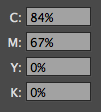
The colour scheme I have chosen includes:


No comments:
Post a Comment