At the start of this course I did have an understanding of media knowledge, as I did take media studies at GCSE level. However I have gone into much more detail as the work is more advanced, for example in the textual analysis' for film trailers, I added descriptions, explained why and described the effect on the audience.
I have also learnt more sophisticated vocabulary and really useful terminology. These included words such as; connotation, representation, codes and conventions, visual codes, linguistic codes and more. With these words, I put together a glossary on Google Docs, giving a simple explanation of each word.
I have also completed a sound and lighting analysis on the Captain America film trailer, as well as a more detailed textual analysis on the Monsters University trailer.
Here is a screen shot of my week schedule that I created on Google Docs, to help me stay organised and up up date with my work. I added homework and other blog posts that needed to be published, so I did not forget and so that all the work that still needed to be done, was completed.
Here is another screenshot of the updated schedule that I have filled in with up to date tasks and activities on what is still needed to be done.
The scene I chose to analyse is from the film Monsters University, it is the first morning scene in Mike's and Sully's new accommodation.
At the start of the scene, the camera starts by slowly zooming out from the window, to show that it is in the early hours of the morning. The angle then turns slightly so that Mike is seen sleeping and to expose the sound of Mike snoring. Next a quick cut occurs, showing that Sully is sleeping in the top bunk. After that, the alarm clock sounds and a close up on Mike throwing Sully's hand off of his bed is seen, then sharply transitions into a a longer shot, showing Sully fall off the top bunk.
The music that is played at the start of the scene is soft and slow, representing a typical morning atmosphere on their first day. Towards the end of the scene, the camera is placed already outside of the door, making the audience aware that something is going to happen. Then Sully and Mike scramble and fall through the door with a loud bang, exaggerating the effect of them hurting themselves. Next another quick edit is used, to show the rest of the group stood waiting with a camera to take a picture, which brings a comedic element to the scene.
Near the middle of the scene, an over the shoulder shot is used, when Sully is staring at Mike sat on the bed, ready to expose Sully's shedding. A wide shot its also used near the end of the scene to show all three of the monsters, plus the background as well to get an idea of the setting and the old-fashioned decor of the house.
Camera Angles/ Camera Shots
There are a variety of camera shots used in this trailer including; close ups, medium shots, longs shots and lots of quick transitioning edits. There are also tracking shots, slow pans and some extreme close ups to increase the intensity of a clip, as well as adding more detail. For example when Sully is given the 'dream journal' a close up of his hand and the book is used, to show the appearance of how exaggerated the cover is. Also a very long shot is used when nearly the whole university campus is on screen, to represent how large it is and the huge amount of monsters that go there. This makes the audience feel small compared to the sheer capacity of how the university is made to look.
Target Audience
The likely target audience for this type of film would be children and young teenagers, as it is an animation and uses child- friendly comedy. Also the fact that there was a previous film (Monster inc) would mean that the same type of viewers will be watching this newer film, as the first one was rated quite highly. A few intertexts of this film would be something like Toy Story and other Disney Pixar creations. Similar codes and conventions that are specifically found in pixar and animated films are; creative and imaginative story lines, animal and objects come to life, and often exaggerations of stereotypes. For example in this trailer all the characters used are fictional and is not a representation of real life, which is very conventional for an animated film.
Editing and Sound
Quick, sharp edits between clips are used to keep the audiences attention and to represent modern day technologies. A mixture of soundtracks are included in this trailer depending on the mood of the individual scenes/clips. At the start, the music is quite powerful and intense and then suddenly changes to a more upbeat, joyful soundtrack that connotes the comedic element of the film. These are all forms of non- diegetic sounds.
Lighting
The lighting is also quite dependant on the clip, however for the most part a natural-seeming light is used. Although there are also quite a few dimly lit shots, which connotes the night time or scenes of sadness.
Term of the day- Iconography
Objects and symbols in an image, e.g. iconography of a classroom would be: books, uniform, whiteboard, desks, etc.
Here is a screenshot of some feedback that was commented on my work, that was given to me by my peers. It is important to peer mark because it is very helpful to know other peoples opinions and they can also help by spotting spelling errors that you may have missed.
Sound is a very important element of film making and can often improve the overall effect of the film. For example adding a soundtrack can really intensify a scene and would make the audience aware that something is about to happen. Also it can really set the mood of the clips and can help the viewers identify the specific theme or genre. E.g. it is very conventional for a horror film to include a scary soundtrack, that increases the pace and purposely builds tension for effect.
A film can also be improved by adding sound effects, which would make the film seem more (or in some cases less) realistic. For example in a scene of violence or some sort of conflict, the fighting sounds are often exaggerated to make the scene more exciting and very dramatic.
For this short film, my group and I teamed up and recorded sounds on a hand held recorder, that we can use in our own films. Once we had recorded the sounds that each of us needed, I inserted them onto the Premiere Pro software, so that I could start editing in the effects and the soundtrack.
Foley is a type of sound that is produced after the film has been recorded, to recreate everyday sounds that match with the specific clips. This includes sounds like; footsteps, door squeaking, wind blowing, nails tapping and even dogs barking if it is recorded after, to make the clips more realistic and to increase the sound quality.
Improvements that I would make to the sound, would be to make sure that I actually cut the audio recording in the correct places on each of the clips. This is because on some of the clips, there are random sounds that do not match with the visual.
1) Here are some examples of type in different places that use a similar typeface.
I used this font for my blog because it is clear and not at all distracting from the content of my blog.
This screenshot was taken from Wikipedia and is used throughout the website. This is used so that anyone can easily read the necessary information that was searched for, quickly and efficiently.
This is from Youtube and is used for the headings of each category. This is bold compared to the other bodies of text used on the website and therefore stands out as a title.
This is the title of the media group on Facebook and again is used as a heading. This is used because it's very simple and stands out as a heading.
This screenshot was taken from Google search. They have kept all the font the same because it may be distracting otherwise, as users would just need the search engine to find certain information and would not want lots of different typefaces, as it could get very confusing and hard to understand.
These screenshots are from a variety of websites including: my blog, Wikipedia, Youtube, Facebook and results on Google search. These fonts are all very clear simple and therefore really easy to read and understand.
2) The difference between the typeface and a font is that a typeface is a family/group of fonts, whereas a font is more of a specific style and size of the characters.
Typeface is the type design for a set of fonts, and variations of this design form is called the typeface family. Often the set of fonts that are within a typeface all share common design features.
Font includes the style, size and spacing of a set of characters.
3) The difference between serif and sans serif faces is that serif fonts have small tails coming from the starts and ends of the characters. On the contrary, sans serif does not include this design feature and therefore joins all the way around the characters.
For example here is the difference between them visually. I took these screenshots from Google images.
As you can see the serif face has feet and the width of the font varies.
In sans serif it does not have these feet and is the same width throughout.
My group and I worked together to create a silent film. We all brainstormed our ideas and eventually decided on a story, we later began the actual filming process.
We decided to keep it simple and do the majority of the recording in just one room. This is conventional of a silent film because they do not use very many different camera shots in early films anyway, and therefore would make sense for us to stay in one area. We filmed around 12 different clips ranging from a few seconds to nearly 2 minutes, most of these were deleted during the editing process, as they did not end up working with our film.
After the filming, I uploaded the clips onto the computer and then used Adobe Premiere Pro to edit the film, which included; cropping the size, adding a black and white filter, cutting from clip to clip, inserting a title and more.
The usual codes and conventions that are found in silent films include; some sort of musical accompaniment, any dialogue or narration was shown by using inter-titles, black and white effect, square film and finally the very limited use of camera angles. This is very conventional for a silent film because the camera would very often stay in the same place and would not change angles. This is because it was still the early cinema time era, where there was a lack of experimentation towards camera shots.
Most of the styles and conventions that are typically in silent films have been incorporated into my film, including the black and white effect that represents the time when coloured film was not yet invented. Also the more square look to the clips is conventional for an old black and white film because the camera used would of shot square film and not rectangular like nowadays.
On the other hand something that is quite unconventional of a silent film is the quick, sharp cuts between clips. This is more of a modern technique used in film making and therefore might be considered unrealistic for an old film to be shot at so many different angles.
Also the fact that the film is so clear and crisp is also quite unconventional because back in the olden times when silent films were very popular, they would not have been very good quality and looked quite fuzzy.
Now much more modern effects are used in film making, for example; IMAX, HD, 4K and 3D.
Click the film above to watch the silent film 'Trapped' on Youtube.
Here is the colour wheel that was created on Photoshop, that includes my colour images that were taken around the college.
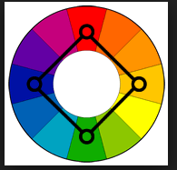
Six types of colour harmony:
1) Complimentary colours- opposite on the colour wheel. For example red and green compliment each other because they are both very vivid and bright.
2) Analogous- these are next to each other on the colour wheel and often used in peaceful designs because these are found naturally in nature as the colours are quite subtly different.
3) Rectangle (tetradic)- this is four colours, two pairs complimentary. This scheme is very colour rich
and works best if one colour is dominant.
4) Triad- these are evenly spaced around the colour wheel. to be successful the colours have to be balanced and one should be the stand-out colours and the other two should be the accents.
5) Split complimentary- this has a strong visual contrast like the complimentary pairs. These colours tend to work really well together and are often good for beginners.
6) Square- the square theme is similar to the rectangle scheme however you have to pay attention to the balance between warm and cool colours.
My group and I explored the college for as many interesting colours we could find and took picture evidence of them on our phones. Here are a few of the more unique colours that I took on my mobile phone.
Once I had the images on my phone I transferred them to the computer and inserted them into Photoshop. At which I learnt how to manipulate the images so they would blend into a colour wheel, which I found off of Google.
In the same lesson I also learnt the effect that colour has on people, and found out that a colour can connote a certain feeling or mood. For example blue can make someone feel calm and relaxed, however red connotes danger and therefore makes you feel on edge.
This is the start of my article on 'Meg's Fashion' created on Indesign.
The first thing I did was create some interesting, fashion related questions that I could ask Megan, to achieve the information I needed for the article. I then interviewed Megan and wrote down her answers in my notebook. After typing these up I presented the article in a simple Q & A format.
Later in this lesson, I learnt the basics of InDesign including; creating a new project, inserting columns, adding text, making the text continue to other columns, experimenting with layouts and how to insert, move and resize an image. Along with adjusting text size, colour and font.


