Friday, 9 June 2017

End of Year Show Evaluation

I was really pleased with the layout of my display board and how all my work was presented. It really stood out and caught a lot of peoples eye. The main focus was on my posters and articles which worked really well with the simplistic theme and very little decoration meant that there was no distractions when it came to looking at my projects. I wanted it to look very professional and interesting and I'm pleased to say that I did achieve this.

The show was great and I was asked many questions on my work, especially the A2 cyber awareness poster which was one of the main attractions on my display. Although there wasn't many employers that attended, I did get approached by many visitors interested in what I had created. It was also nice to show my family and friends what I have been working on in the past two years at Bath College. They were all really impressed and I was proud of what I produced.

Next time I'd definitely make sure that I invite more employers to the event, as lots were either busy or simply didn't want to come in their spare time. That way I would of had more chance in actually having someone influential there, and potentially could be a future employer for myself and others. Regardless, I still got the opportunity to showcase projects I have completed during my creative media course and to get my work out in the open. This then shows my work to others excluding students, as they may have a connection in the industry.

Overall I think the event was a success. I also think many who attended the show, showed an interest in my work displayed and wanted to know more by asking questions.   

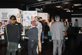
Here are some pictures of the event:


Thursday, 8 June 2017

End of Year Show

After the brainstorming process of coming up with themes and ideas for our end of year show, I had to complete a number of other tasks before hand. For example, I was chosen to design the end of year show invite on behalf of the creative media students. I will include some screenshots below:


I made it very simple and to the point. I also used the college colours, so it fitted in with the theme of the event and to tie it in with Bath College itself.

Another task was to think about and design how I want my individual display board to look. I decided on a very clean, simple, minimalistic style as this would not distract from my work. It would also make my projects stand out, because my posters will be the main focus.

This is how my display board turned out:


Friday, 12 May 2017

FMP- Evaluation


My final major project was an anti cyberbullying campaign, that consists of three posters and two online banners. The first strength of my final designs was the fact that they all had a simple, clear layout, which made it really easy to understand and to interpret for the target audience. Another strength would be that all ads/posters link in with the campaign and all look a part of the same group. For example the font, font sizes and logo was the same on each of the platforms, tying it in with the others and the overall reasoning for this campaign. I also liked the photography used in each of the designs, it made the look and feel of the ads very intense and involves the audience with the issue. For example, one image had a direct mode of address, which intensifies the poster further. I also made sure that each of the slogan titles were strong and powerful, making the posters compelling to the audience and even more eye catching. This may provoke an emotional response, therefore making the campaign memorable and effective. 

The weaknesses of the design would probably be the online banners looking very similar to the posters. In hindsight, I would've adapted the online versions a little more, making it clearer that they were online ads and not just stretched out posters. Another weakness is the logo design, as I think this could've done with a bit more work. It is very simple and could of made it more detailed and personal to me and my brand. I would of added my own fingerprint rather than an image, making it specific to me and more interesting.

The main idea of this project was to raise awareness of cyberbullying and make young children and parents aware of the possible effects of this. This campaign is to spark a powerful and emotional response from my target audience, making the issue more well known and to intensify the effects that it could have on a child. It would then make the children and parents more cautious when it comes to online safety and how to be careful online. I did a variety of experiments throughout the research and production process, from simply asking my peers their opinions, to detailed focus groups on final designs. This greatly affected my development, as the audience's responses was very important to me. I changed many design elements of my layouts including; portrait to landscape, font, text size, images, colours and more. 

I found a similar poster to mine online, to compare the similarities and differences of each design. The top is off Google and the bottom image is my design:


The most similar element between the two, is that they both have visually shown a physical wound as the same pain you would feel from cyberbullying, even though it is not specifically direct. This creates a 'shock' response from the audience, overall making it more compelling and powerful as an awareness advert. Both have a small logo in the bottom corner, relating it to an organisation or brand. This establishes a link between the campaign and therefore presents the posters as being reliable and professional. The main differences is to do with text, my design has considerably more than the image above. On the other hand, neither distracts from the image which is the main hierarchy of the layout and has the most impact on the design. Another difference is the background and eye contact, I do have few different layouts which do have a direct mode of address as I think this creates an intense affect. Although in this design, I do think it works and makes the model look sad and upset, again making the audience feel from the ad.

The key areas of development in this project was mainly layout and the actual design of the posters. I changed my idea many times as I just wasn't happy with the results. I developed my ideas in the initial stage of the project through mood boards, brainstorming and peer's feedback. Although the main area of development was with the changes and updates with layouts, as this is where most of the progress can be seen and evidenced through blogs.

Towards the end of assignment 3 I asked for feedback on my final (at the time) designs from friends and family. The response I got was really positive and I felt really proud and happy with what I'd achieved. I had a few more changes that I wanted to make and since then, the comments have been even better, I am pleased with what I have created and happy with the finished results. Something that I would change with my final project would be to create more of a contrast between the posters and the online banners. This is so that it is more obvious for the target audience to interpret and so the relation between the two platforms is more distinct. Looking back, I would also improve the logo design on each of the adverts, making it more unique and detailed. The final thing I would change is to make sure to take a larger variety of images during the photoshoot. This is because it could've given me a better range of photos to use when it came to the production process and therefore, offered a bit more variety and difference between the adverts.

After reviewing my statement of intent my idea has developed a lot. Originally I was creating a social issue awareness campaign, this had since got more detailed and adjusted to a cyberbullying awareness campaign. Apart from this, my reasoning and explanation remains the same, as I am interested in the visual creativity behind shocking and thought provoking adverts. Also in my statement of intent I was unsure of my target audiences. I have now developed this and through brainstorming and research, I have decided that my target audiences are children aged between 9-13 and parents. Overall, I did manage to do everything I set out to do and improved/adapted this slightly along the way. 
  
Reflecting on my pitch to the client, I was fairly confident with my idea and felt like I had planned out what I was going to do. Along the way, I have had a fair few issues but overcame them with contingency plans and even a plan C! I think this project has gone how I expected, as I knew there would be hold backs, but was prepared for some in advance. The feedback was mostly good things and some improvements were mentioned from the lecturers. This was things like narrowing down my target audience and brainstorming further my research process. Next time, I would have clearly planned out a time schedule and given myself more time for the actual production and design portion of the project. I would also improve the research on my topic because I should of given myself more time to get the focus group organised and a date and time secure. Unfortunately this didn't happen so was rushed to get it completed. 

In conclusion, I am pleased with my final project but there would be a few things that I would improve and change. However taking everything into account, I am happy with the final product and have enjoyed creating and designing my adverts.
Tuesday, 9 May 2017

FMP- Modifications and Update

I have gathered some feedback on my final major project and have made amendments according to what was said. I have included some before and after images of what has been changed so far:


In this design have changed the size of the title text, as it needed to stand out more and catch the target audiences attention. It also looks a lot better because there is more contrast between the two text blocks, and therefore makes the advert more professional. I also took away the writing next to the small logo in the corner, because this wasn't really needed.


In this layout I have made the same changes as the above design, as I like the simplicity of both layouts. I didn't need to improve a lot on these designs as the feedback given was mostly positive.
 

This design I have changed completely, as the feedback that I was given reinforced what I thought at the start. I did not like the image used and made it difficult to create a landscape poster because the background wasn't big enough. The fact that this layout was portrait, didn't really go with the rest of the campaign and stood out like a sore thumb. Another point that was made was that the text looked in an odd position and didn't quite work visually in the design. So I decided to use a different image entirely, enlarge the text and remove font by the logo, as mentioned in the above layouts.

Thursday, 27 April 2017

FMP- Progress and Development

This is an updating blog post on the progress and development I have made. Now I have my final photographs, I can add them into my template layout designs and see how they fit in with my slogans. I have also edited a lot of the images in Adobe Photoshop, trialling out different edits and filters that match with the theme of my adverts. For example, I chose to have a fairly dark, dimmed lighting set up throughout most of the photos, as I want the overall feel of the adverts to connote sadness, hurt and upset. This is because it will get me the most emotional response with my target audience and will make the theme more powerful and rememberable. Because of this, I will be effectively raising awareness on cyber bullying and the possible effects on the victims that are caused by this.

I have included two of the edited images below:


After the editing process, I inserted my favourite images into the templates that I have previously designed. This gave me an idea of what my final adverts may look like, I decided to change a few things around after doing so. I have included some more screenshots below of my progress up to this point:


This is what my final posters are going to look like. There may be a few small changes in the mean time, however this will be the design and overall look of the adverts.

Tuesday, 25 April 2017

FMP- The Photoshoot

Today is the scheduled date for my actual photoshoot, set up with me as the photographer and Maisie as the model. I have my own camera at home that I will be using, as well as all my props and equipment for each scene. I also have the makeup products that I used in my experimentation blog post, that I will be using for the special effects (bruises, cuts, etc) on my model. I will include a quick image below of the model:


I took a variety of images so I can pick and choose when it comes to adding them to my layout designs. I have also included a few of the photos from the main photoshoot below (all untouched):


The best images in my opinion are the ones with the model holding the mobile phone, as this is probably more relevant in modern day society as computers are less and less used. Also, the images with the computer look less professional, as most of them do not have a plain background. I will need to decide which looks best on my template designs.

One of the problems that I came across during this process, was that the location (my house) wasn't the best for the lighting element of the image. Because this photoshoot could only be scheduled in evening times, artificial lighting was the only option. Although at the time, this didn't matter because I wanted the images to be quite dark and dimmed anyway, connoting sadness and hurt. I am going to play around with the photos on Adobe Photoshop, trying different filters, edits, saturation, colour, etc. I will document this in a progress blog post.

Thursday, 20 April 2017

FMP Experimentation and Progress Update

Following on from my layout ideas blog post, I have pretty much completely changed my idea and design, as I really wasn't happy with it. I have made the design a lot more simple and clear, which I think makes the overall visual more appealing and professional. I also came up with a few different slogan titles. I prefer the middle one personally, however they may change a little during the production process.

As part of my experimenting, I decided to put together a few layouts with slightly different fonts and slogans. The image is not mine and taken off Google Images for the purpose of this experiment. Also my own images will be used for the final project, I will also be using makeup to create skin bruises and cuts on the model. My idea is to have a physically hurt girl on the poster in front of a computer screen, symbolising that pain can still be felt even if it is not physical and through a computer screen.


I created the above designs on Adobe Illustrator, however my final project will be put together on Adobe InDesign, as this is a layout software and will fit the purpose better. As for the experimentation portion, I have asked a number of people which one was the most liked out of the three. It came back that the middle image was the most popular and that the slogan in this design was the most powerful also, combining to be a simple yet compelling poster.

I also did another experiment learning and practicing how to create fake bruises that look realistic with makeup. I already have an interest in makeup so thought this would be a better idea to do it in person, rather then trying to edit wounds on in Photoshop from scratch after. This is because it would be too time consuming to learn and then produce professionally in the time scale for production.

Below I have included some pictures of the bruises I created, I practised these on myself:


I also took a picture of the makeup that I used to create the bruises:


This will also be the same products that I will use on my model in the photoshoot I have scheduled for next Thursday. The items were chosen from the makeup that I already had, making sure that all the colours were matt for the most realistic finish possible.

FMP- Research Reflection

After gathering and presenting my research, I am going to outline how useful I found it when progressing on to the next stage. Because of many issues with the research at the beginning of the process (as mentioned in the previous research blog post and assignment 2 screencast) I completed the research at a later date.

The results that I accumulated from my interviews helped me with the understanding of both the parents and the child's view on social media. This then allowed me to create three different poster layouts that would attract the attention of both target audiences. This is because I found out that both audiences pay attention to awareness ads/posters in and around school, especially on serious and powerful subjects such as cyberbullying.

I think this research has helped me with what to actually create, rather than the design element of the process as neither interviewee's had experience with design and layout. A lot of the template design layouts that I created was simply from the ideas that I already had. What I mean by this, is that it was useful to find out whether to create more posters or online ads.

I have also made an experimentations and progress blog post, where I carried out a few tests and experiments on what I had already designed. This helped me a lot as I discovered which layout was the most liked and why. I am currently still continuing with this process now.


Wednesday, 12 April 2017

FMP- Research and Findings

The research that I have carried out was a combination of two different interviews. This has changed slightly from my original plan, as I have had a number of issues with the organisation of the focus groups. This plan was in fact plan C for my research! Plan A was originally to visit my local primary school and talk to a few of the older children for my research. However the school had contacted me at a later date, informing me that they cannot go ahead because of SATs at the time. My backup plan (plan B) was discussed with my tutor Jo, who gave me a contact that I could email, this specific contact is involved with two youth clubs near me. I emailed him and I received an automated email back, mentioning that he is currently on holiday and won't be back until 8th May, which would be cutting it a bit fine with the deadline. So that is the explanation of why I have resulted in plan C.

The Interviews:

The first interview was with Ruby, aged 13, which is part my target audience of children aged between 8-13. The other interview, was Heather, aged 48, who is a parent and is of an older generation. In these interviews I got a variety of results ranging from one extreme to the other. For example, one said that social media is a bad influence on younger children and that it could lead them to isolation and bullying. Whereas on the other hand, another said it is completely ok and that it helps children connect and 'fit in', actually avoiding the chance of physical bullying. Both of these I believe are valid reasons and because of the interview method, it has helped with the understanding of these points. This is because it enables people to explain their reasonings, as in comparison to a survey where the answers are very black and white.

The main points which I found out from Ruby's interview:
  • That she is on Facebook purely for the games.
  • Has Facebook and Instagram.
  • Her mum does know about the social media accounts she is on.
  • She knows everyone linked to her account.
  • She does take notice of the posters around school.
  • Is careful with her passwords and log in details.
I will a link to the feedback below:
The main points which I found out from Heather's interview:
  • Was aware of daughter's social media account.
  • Concerned of how much time her daughter spends on Facebook.
  • Does take notice of the posters around school.
  • Trusts her daughter to be safe with passwords.
  • Is unsure of online games and if they use their own online messaging platform.
I will include a link to the audio of this interview:

https://drive.google.com/file/d/0B5ozmGisBBAONVFmLWZGVHNQejQ/view?usp=sharing

Friday, 7 April 2017

FMP- Template Layout Ideas

On Adobe InDesign I have put together a simple layout design for a print poster. I used an image off https://www.dreamstime.com/ to help me with this, however I will be using my own photography in the final advertisements. I struggled to find an image that I liked and could use for this idea, so I resulted with the image below, which will be changed.

At the moment most of the text used is dummy text, although I have come up with the title 'You don't really know me', as I think this works within the context and makes the audience think. This is only a very first draft of what my poster might look like, however this may change throughout the production process.

I have included a screenshot below:


The picture I have chosen represents an unknown person using a laptop and suggests that he/she is up to no good. This is mostly because of the hoodie, which is stereotypically connected to rebellious teenagers and people who are doing something illegal. I also have added text message bubbles on the poster surrounding the person, which a lot of younger (and older) generations are very familiar with, which would then make the advert more relatable to the target audience.

I chose to put the text in the centre as it stands out and it is the only place where there is blank space, therefore being the most clear. The weaknesses of this design is that it is a bit busy and cluttered, making it difficult for the audience to identify a hierarchy. Also in my opinion it looks quite unprofessional, this is because the text and images aren't lined up correctly and appears amateurish.

With moving forward with this idea, I am going to think about other layouts that I can create, as I am not happy with this first draft as mentioned and explained above.

Thursday, 6 April 2017

FMP- Issues and Resolutions

In this blog post I am going to identify some of the issues that I may encounter during the researching process, and how I can fix them. One that comes to mind immediately, involves my visit to the after school club for my focus group and if I can complete in time for the deadline. If there is an issue with this, I have come up with a solution. I am going to put together a series of questions that I would like to ask and also create a worksheet of some sort that the children can fill in. These questions and worksheets can just be emailed to the headteacher of the school and could be asked by someone who works there. This would mean that I would not need to be present and therefore would save a lot of time, I can then present the research findings as usual.

An issue that I could encounter with the questionnaires, is feedback from an irrelevant target audience. For example, if I am posting these surveys on social media sites, there is no way of knowing who is completing them and if their results will be useful for my research. Also the fact that my main target audience is of the younger age range, I have very few friends under the age of 16. With this issue there isn't really a solution as such, however I can still use this method because my next target audience is adults/parents and social media is a good way of connecting and would help me to gather feedback from this market.

Technical issues that I might come across would be anything that could go wrong with my photography equipment during the shoot. This would be a pretty easy solution and would involve going back to college and asking for some technical help and possibly borrow a new equipment.


If any issues un-predicted occur during the process, I will have an update blog post which will include my progress and any problems that I came across.

Friday, 31 March 2017

FMP- Applying Research & Developing my Ideas

My idea so far is an awareness campaign, specifically focussing on cyber awareness and how children should be safe and aware online. Going into more depth with my research, the focus groups I am going to conduct are going to be with a small group of 10-11 years olds, as well as a group of adults who are parents as well (not necessarily related to first group of children). I am going to contact my local primary after school club, to arrange a meeting with a small group of children, asking a variety of questions that could help me with the development of my idea. For example, if the children say that they don't take any notice the posters around school, I may need to adjust my final adverts and do just one print ad and two digital ones instead.

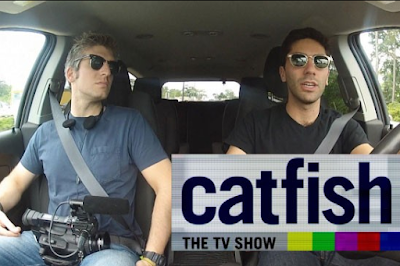
As with the adult focus group, this could give me an indication to how much they know about internet safety and if they know how easy it is to create an account underage. Not only this, but how anyone can easily have an account that is not who they say they are, as demonstrated on the popular American TV show, Catfish.


From the proposed research, I have developed my idea further by understanding exactly what focus groups I am going to carry out. As well as how I am going to plan and arrange this with my former primary school. I now have a clear grasp of what is to be done next.

Thursday, 30 March 2017

SWOT Analysis- Research Project

I created a Piktochart to go along with this blog post to present a SWOT analysis of some of the work I have completed throughout the year, showcasing what I am proud of. It includes strengths, weaknesses, opportunities and threats of each of the final projects. Going into detail with design, purpose, audience and also includes screenshots of each of the final products.

The first project I wanted to showcase was my high end fashion magazine. I am really proud of this because I created this completely from scratch, including all elements of design, photography, written articles, all content and layout. It was a full 16 page magazine that turned out exactly how I wanted and looked really professional and high end.


Strengths:

Overall looks professional
Lots of vibrant and good quality images
Fits with the high end theme

Weaknesses:

Include more detailed articles- more variety
Only a 16 page magazine

Opportunities:

Also can read magazine on a digital format
Target audience interested in new trends
Can present in end of year show

Threats:

Competitors have a series of issues already
Could have problems with the printing process due to expenses

The second piece of work that I am proud of is my digital website design for both computer and mobile platforms. This includes a homepage and a product page each designed for desktop and mobile viewing. It took a lot of work but overall I am pleased with the finished project, especially the desktop product page as I think this looks clean and modern.

Strengths:

Overall looks professional
Has both desktop and mobile version
Includes hover states for good user experience

Weaknesses:

Mobile version is a little bit small
Product page looks better than homepage
Top panel too simple


Opportunities:

Can be used on two platforms
Can present in end of year show

Threats:

Competitors have a more interactive website with videos etc
Technical issues could occur


The above is just a screenshot, however I have included a link below to to my finished Piktochart, analysing each area on SWOT in detail:
https://magic.piktochart.com/output/19042851-swot-analysis

Thursday, 23 March 2017

FMP- Types of Research

The types of research I can do to support my product development will be a variety of both primary and secondary. For primary research, I am going to organise two small focus group asking questions to my potential target audience for my FMP idea. This will provide more detailed answers which can then be explained in depth, as in compared to a questionnaire which is much more vague and focusses on quantity not quality. In terms of secondary research, a lot of this will be online because there are many articles on social issue awareness campaigns and why they are the most powerful and effective. For example here is a link to a really good online source that I found: http://www.boredpanda.com/powerful-social-advertisements/

I will also have to research and look into other successful campaigns that have really made a difference and remembered by members of the public, and how these adverts effected them emotionally.


As mentioned above, most of my sources will be online as this is mainly where these types of ads are promoted. Although, quite a few of them are also published and are used as posters and presented on billboards, so I will be designing two print adverts and 1 digital advert as my campaign. However this may change according to the feedback I get from the focus groups.

Monday, 20 March 2017

FMP-My Course Development

Throughout the Creative Media course I have developed a variety of skills. These include fairly basic skills like my growing of confidence and having a larger media related vocabulary. However as well as this, I have also developed very specific techniques on the Adobe softwares such as Photoshop, Illustrator and Indesign. These will help me a lot in the 'real world' when it comes to getting and having a job in the media industry, it will show that I am aware and know how to use the required softwares and potentially progress further into learn more.

As mentioned above I think that from presenting pitches and presentations in front of an audience, it has really helped me with gaining confidence and professionalism in a business-like environment. Overall my main strengths on the course would definitely include the design element of creating promotional items like posters, adverts and magazines. I can really tell what looks good and have a great eye for detail when it comes to making something professional, both print and digital.

My weaknesses on the course would probably be the initial coming up with ideas and templates to get started on a new project. For example, the brainstorming element of the process that allows me to make a final decision on what I am going to do/design.

I have really developed on my knowledge when it comes to working with real clients, as I have had the opportunity this year to do so. This was completely new to me and was the first time interacting with a real client that's not part of the college. I have learnt how to pitch my ideas and artwork to my advantage, as well as taking constructive criticism on my work and correcting them.


Friday, 17 March 2017

My FMP Idea (Year 2)

For my FMP this year, I have decided to stick with the same topic I did my research project on, 'Awareness campaigns and their effectiveness.' However, I will be designing and creating my own awareness campaign, instead of just analysing and researching the statement above as I did in my theory work.

With this, I am going to come up with an interesting and creative way to raise awareness on a social issue, as well as making the audience feel in a certain way. For example, sadness, guilt, shock, etc.

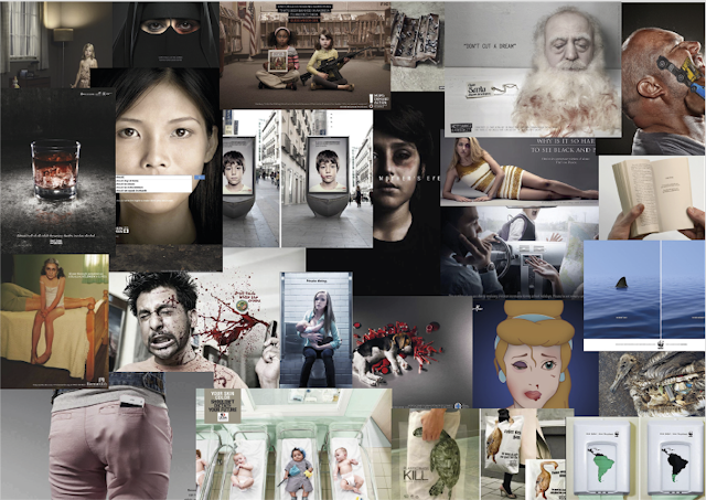
Here I have put together a range of some of the most powerful social issue campaigns that really shocked the audience. I have created a mood board below in Adobe Illustrator, presenting these advertisements.


I want to be able to come up with a really unique, interesting way to raise awareness through imagery. The adverts above have a very meaningful message behind the visual aspect, which is something I want to include in my own ad campaign.

Friday, 10 March 2017

Accessibility in my Handmade Book

I will show consideration for accessibility in my handmade book, for those who struggle with a disability like dyslexia, colour blindness or people who have limited vocabulary. These can all affect someone's ability to interpret information.

The first thing is that my book is a pop up book, which immediately is more interesting and visually pleasing in comparison to a normal story book. This already makes the story narrative a lot easier to understand and is a lot more clear for people who struggle with language and text. As well as this, I will be making sure that the colours I use are complimentary and do not clash making it hard to read for colour blind audiences. For example no red and green, text and background combos!

Although there will be text in my book, it will be very limited as most of the attention is going to be on the pop ups and imagery. Making it very easy to follow for those who usually find this difficult.

My product will be tuned for my target audience, as it will mainly be targeted to handmade book collectors. I am making my book very delicate and intricate, as collectors will appreciate complex artistry and detailed designs. Although it is a children's narrative it will still be aimed towards adults, purely because of the handmade element of the book.


Building Prototypes

I decided to practice making a pop up for my handmade book brief. This resulted in two attempts of the same design, as the first trial didn't quite work. I have included some images in this blog post to show the difference between the two pop ups that I made.

This was the first attempt at making a pop up and as you can see in the picture below, the cuts and measurements didn't quite match up, making it very difficult to fold.


I gave this a second try and here is the finished result:


This worked out a lot better and I am very pleased with this prototype.

Thursday, 9 March 2017

Reflection on MOBAW Leaflet

My leaflet was not picked by the client for a final draft viewing and the reason being was the overall darkness of the design. As mentioned in the previous blog, this was mostly because of the printing quality and I think this was the main thing let me down.

On the whole, the project for me was quite challenging. I think this is because I like very modern, unique designs, which didn't quite fit in with this particular brief or museum. Looking back, I probably would of gone with my original template, instead of something I thought the client might like. Another thing I would of done differently, would to use less text throughout the leaflet and enlarged some of the images instead. Along with this, I could add in actual type and write my own information on the museum, making it look more individual and realistic.

I would of liked the opportunity to produce another design for the client after I have heard the feedback. As a lot of this were fairly simple changes and would of only taken a couple of minutes to correct. Unfortunately my design wasn't good enough for the client to want to see more and I believe this is mostly because of the printer issue at the beginning of the production process, which put off the client from the get go.

Overall, I am happy with my final draft design and can at least use this for my end of year show.

Tuesday, 7 March 2017

MOBAW Feedback

The feedback from my first leaflet draft was overall okay, however there were a few things that needed to be changed. For example, the client on the whole didn't like the colour scheme and said it looked very dark and dull. I understood this comment, however this was mostly because of the printer quality and because of this, it did not help with the presentation of my design.

One element of my leaflet that the client really liked, was the map and how it was shown in a circle. This linked in with the majority of the maps around Bath, which makes it very recognisable to local residents and possible customers of the museum.

For my second draft, I am going to change the colours slightly, as well as brightening the cover image of my leaflet. I am also changing the transparent coloured blocks, as this looks a bit messy and unprofessional. Instead I will use flat colours, which will stand out a lot more and overall improve the dull colouring.

Here a small example below of the changes that have been made so far on my leaflet:


The original is on the left and the updated version is on the right. This design looks a lot more bold and eye catching, making the leaflet look more attractive to the target audience.